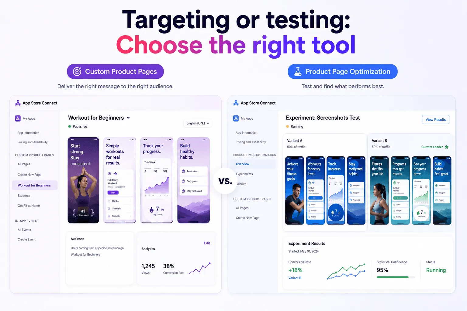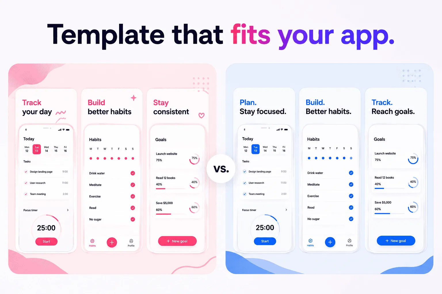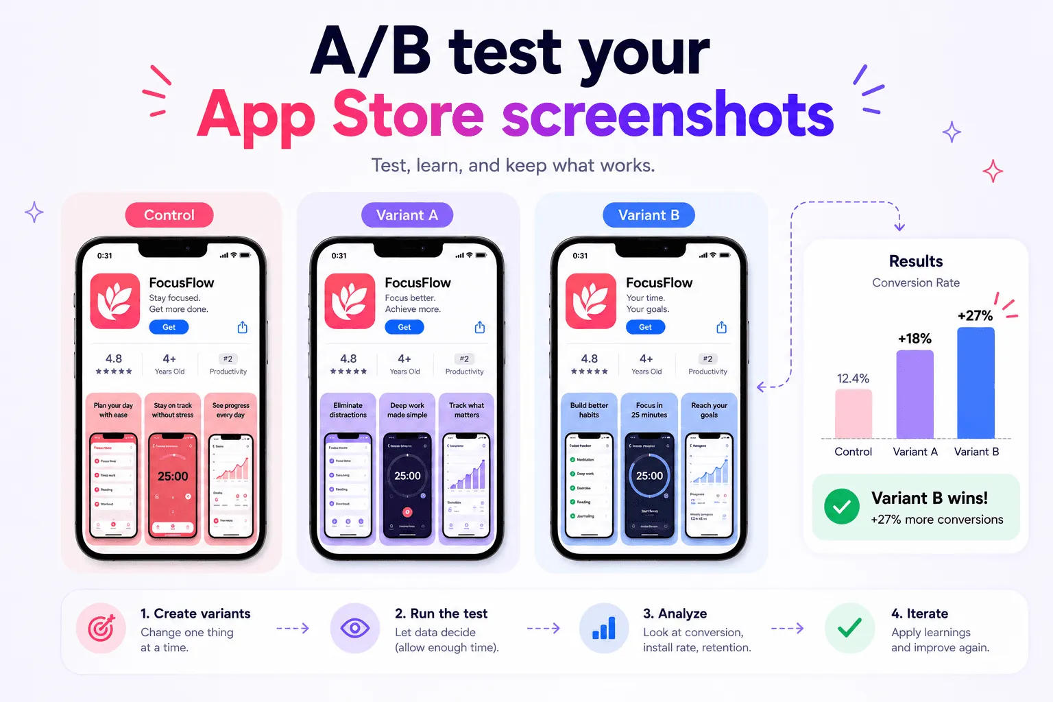

App Store screenshots are often the clearest explanation of your app.
Before downloading, people want to understand what the app does, how it works, and whether it fits their needs. Your screenshots should answer those questions quickly.
A good screenshot set is more than a gallery of product screens. It's a short visual story. Each image should communicate one benefit, provide product proof, or reduce uncertainty.
Here is how to create effective App Store screenshots in 2026.
What App Store Screenshots need to do
App Store screenshots have three jobs:
Represent the app accurately
Explain its value quickly
Give people enough confidence to download it
The strongest screenshot sets balance accuracy, clarity, visual hierarchy, and product value.
Treat the set as a sequence. The first screenshot introduces the main promise. The next images demonstrate the workflow, a story. Later screenshots can show differentiation, customization, integrations, or privacy.
Before designing, complete this sentence:
This app helps [audience] achieve [outcome] through [main capability].
Use it to decide which features deserve a place in the sequence.
Understand Apple’s Requirements
Apple currently accepts between one and ten screenshots in JPEG, JPG, or PNG format. Screenshots are required, while app preview videos are optional.
Screenshots should show the app in use. Apple allows text, backgrounds, device frames, and image overlays, but the underlying product experience must remain accurate.
Apple also expects you to:
Use fictional account information
Keep screenshots current
Own the rights to included materials
Avoid irrelevant imagery from other platforms
Represent paid functionality honestly
Accepted dimensions depend on the device. Current primary groups include 6.9-inch iPhone displays, 13-inch iPad displays, 16:10 Mac screenshots, and platform-specific formats for Apple TV, Apple Vision Pro, and Apple Watch.
Check Apple’s current screenshot specifications before creating templates or exporting assets.
Plan the screenshot sequence
The first one to three screenshots may appear in App Store search results when no app preview is available. They should communicate the essence of your app without requiring someone to open the full product page.
A practical sequence is:
Primary outcome
Show what the app helps people achieve.Core workflow
Demonstrate how the main task works.Key differentiator
Explain why someone might choose this app.Secondary workflow
Introduce another important use case.Customization or integration
Show how the app fits existing habits.Trust or privacy
Address an important customer concern.
You don't need to fill all ten positions. Six focused screenshots are more useful than ten repetitive ones.
Each screenshot should have one purpose.
Design for Clarity
Use one message per screenshot. A long list of features has no clear priority.
Instead of:
Plan projects, collaborate, track progress, add notes, and stay productive
Use:
Keep every project moving
The interface can provide the supporting detail.
Keep headlines short, specific, and outcome-oriented. Avoid vague language such as “powerful,” “revolutionary,” or “next-generation.”
The product should also remain large enough to understand. Device frames, shadows, gradients, and illustrations can improve a composition, but they should not reduce the interface to an unreadable size.
Review every design at thumbnail size. Confirm that:
The headline is readable
The important product state is recognizable
The reading order is obvious
Decorative elements do not dominate
Keep typography, spacing, device scale, color treatment, and headline placement consistent across the sequence.
Use meaningful product screens
A strong headline needs visible proof.
If the message says “Plan your entire week,” show a complete weekly plan rather than an onboarding screen. If it says “Understand every expense,” show a useful spending breakdown.
Prepare realistic fictional content before capturing the interface. Avoid empty states, placeholder text, notifications, debug indicators, and personal information.
Capture every required product state from the same app version. This prevents the final sequence from mixing old navigation, inconsistent data, or different visual styles.
Prepare for Localization
Localization affects the design from the beginning.
A short English headline may require much more space in German or French. Arabic needs right-to-left consideration, while Japanese introduces different line-breaking decisions.
Use flexible text areas and define acceptable two-line or three-line layouts. Do not solve every overflow by making the text smaller.
Translate the meaning rather than individual words. Give translators context about the visible feature and intended benefit.
Whenever possible, localize both:
The marketing copy
The interface inside the screenshot
Also review dates, currencies, units, names, and example content for each market.
Upload and Review carefully
Apple can scale high-resolution screenshots to smaller device sizes when the interface is consistent. Inspect the scaled result because text and interface details may become too small.
Use clear file names such as:
iphone-69-en-US-01-primary-benefit.png
After uploading to App Store Connect, verify:
Screenshot order
Device and orientation
Selected localization
Scaled variants
App preview placement
Duplicate or missing assets
A structured tool like Shipper can help keep designs, device specifications, localizations, metadata, and App Store Connect publishing within one workflow!
Common mistakes
Avoid these frequent problems:
Starting with a login or welcome screen
Repeating the same benefit several times
Making the interface too small
Writing headlines that only label the screen
Using outdated product states
Publishing translated metadata with English screenshots
Including real personal information
Exporting without checking Apple’s current dimensions
Quick checklist
Before publishing, confirm that:
Each screenshot has one purpose
The first three explain the main value
Every claim matches the visible interface
Headlines remain readable at thumbnail size
Product data is fictional
Dimensions match Apple’s requirements
Localized copy and interface agree
Screenshot order is correct in App Store Connect
Q&A
How many screenshots should I use?
Use enough screenshots to explain the product without repetition. Most apps do not need all ten available positions.
Can App Store screenshots contain text?
Yes. Apple allows text and image overlays as long as the screenshots accurately represent the app.
Should the first screenshot show the home screen?
Only if the home screen communicates the main value clearly. A completed result or important workflow may be more effective.
Should screenshots be localized?
Yes, when possible. Localized screenshots create a more coherent experience and make the product easier to understand in each market.
Conclusion
Effective App Store screenshots combine clear communication with real product proof.
Start with the audience. Put the strongest benefit first. Use meaningful product states, keep the interface readable, prepare for localization, and verify every export against Apple’s latest requirements.
If you want to simplify the process, Shipper helps you create, organize, localize, and publish App Store screenshots from one native macOS workflow, try it now!