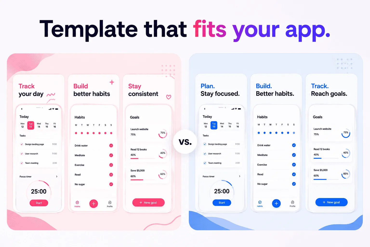
A beautiful screenshot can attract attention. A clear one helps someone decide whether to download your app.
Strong App Store screenshot design connects a relevant promise with visible product proof. The headline explains the benefit. The interface shows how the app delivers it. The composition makes both understandable at a glance.
What makes an App Store screenshot convert
An App Store screenshot converts when it reduces the effort required to understand your app. It should answer three questions quickly:
What does this app help me do?
How does it work?
Why should I choose it?
For example, a finance app might help freelancers understand business spending through automatic categorization.
Apple says the first one to three screenshots may appear in search results when no app preview is available. Use those positions for the main outcome, core workflow, and strongest differentiator. Do not wait until screenshot six to explain why the app matters.
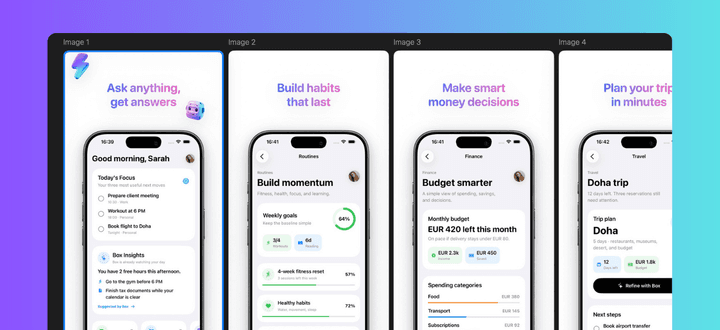
Build one story, not separate images
Plan the complete sequence before designing individual screenshots. A useful six-image structure is:
Primary outcome
Core workflow
Finished result
Key differentiator
Secondary use case
Trust, privacy, or integration
Each screenshot should add new information instead of repeating the same benefit with different words.
Pair every claim with the strongest possible interface state. If the headline says “Plan your whole week,” show a completed weekly plan rather than an empty calendar. If it says “Understand every expense,” show a useful spending breakdown rather than the settings screen.
This relationship between claim and proof is more important than any background, gradient, or device frame.
Design for App Store scale
Customers usually encounter screenshots as small images. Design for that first impression.
Use one short headline, one clear product view, and minimal supporting detail. Four to eight words is a useful range for headlines, but clarity matters more than a strict count.
Keep the interface large enough to recognize. Device frames can provide context and polish, but they also reduce the space available for the product. Use a frame only when it improves the composition.
Review every export at thumbnail size and check whether:
The headline remains readable
The main interface state is recognizable
The reading order is obvious
Decoration stays in the background
Apple requires screenshots to represent the app accurately and show it in use. Text and image overlays are allowed, but they should support a real product experience rather than replace it.
Prepare the design for localization
Localization should influence the layout before the English version is approved. A compact English headline may become much longer in French or German.
Use flexible text areas, allow two-line variants, and keep marketing copy separate from product captures. Translate the meaning rather than isolated words.
Whenever possible, localize the interface inside the screenshot as well. Check dates, currencies, units, names, and example content for each market.
This is also where a dedicated workflow becomes useful. Shipper helps Apple developers manage screenshot designs, device specifications, localizations, metadata, and App Store Connect publishing without rebuilding the process for every market.
Test the message, not your taste
Design reviews can identify readability problems, but they cannot prove which message converts better.
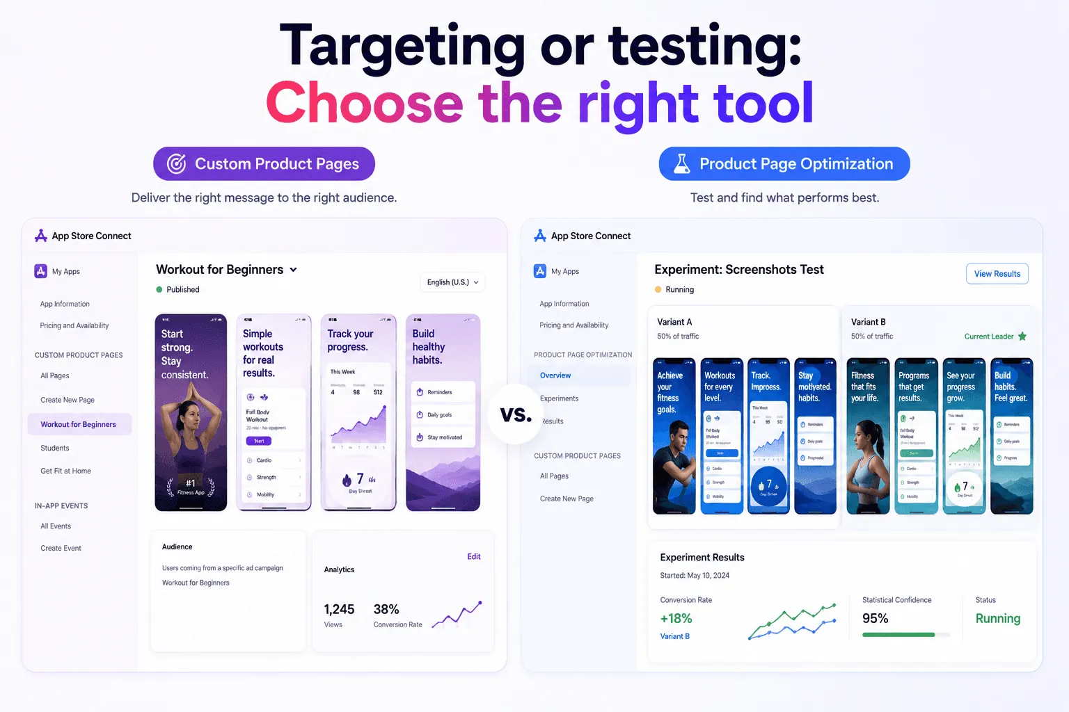
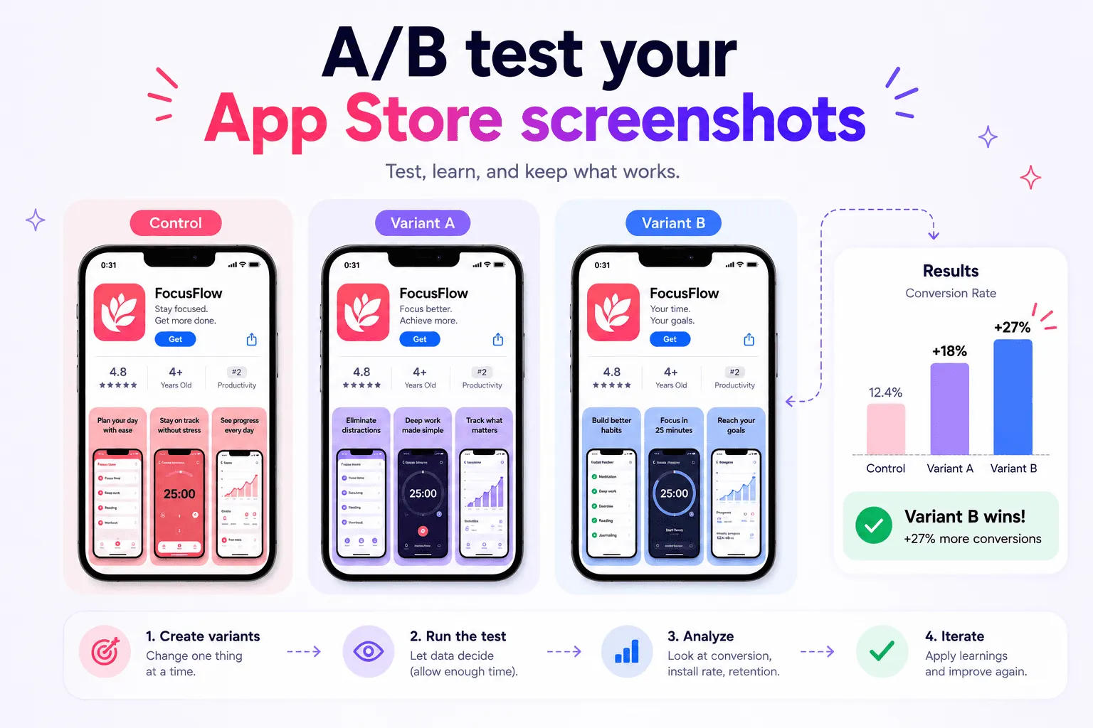
Apple's Product Page Optimization lets eligible iOS and iPadOS apps test up to three alternate treatments containing different screenshots, icons, or previews. Start with one clear hypothesis, such as whether an outcome-led first screenshot performs better than a feature-led version.
Avoid changing the copy, layout, product screen, colors, and sequence simultaneously. A focused test makes the result easier to understand. Let it gather enough evidence before choosing a winner.
Quick checklist
Define one audience and outcome
Give every screenshot one purpose
Put the strongest message in the first three positions
Match every headline with visible product proof
Check the design at thumbnail size
Use realistic fictional data
Prepare layouts for translation
Verify the final order in App Store Connect
FAQ
What should the first App Store screenshot show?
It should communicate the app's primary outcome through a meaningful product state. Avoid beginning with login, onboarding, settings, or an empty dashboard unless that screen represents the app's main value.
Can App Store screenshots include marketing text?
Yes. Apple allows text and image overlays, but the screenshots must accurately represent the app and show the product in use.
Do device frames improve conversion?
Not automatically. A frame can add context and polish, but it can also make the interface smaller. Use one when it improves clarity rather than simply following a visual trend.
How can I test different screenshot designs?
Eligible iOS and iPadOS apps can use Product Page Optimization in App Store Connect to compare alternate screenshot treatments. Test one clear hypothesis and avoid changing unrelated elements at the same time.
Conclusion
An effective App Store screenshot makes your product easier to understand and trust. Lead with a relevant outcome, prove it with the real interface, keep the design readable, and prepare the system for localization.
If you want to simplify the full workflow, Shipper helps you create, localize, organize, and publish App Store screenshots from one native macOS app.