
There is no universally better mode for App Store screenshots. Use the appearance that represents your app accurately, explains its value clearly, and keeps the interface readable at product-page scale.
One consistent mode often creates the clearest set. A controlled mix can work when both appearances are real parts of the experience and each frame has a reason to show one.
Choose the mode that matches the product
Start with the interface users will actually see. Apple requires screenshots and metadata to reflect the app’s core experience. Do not show a dark interface if the app only supports light mode, or present a special theme as the default when it is not.
Productivity and utility apps may benefit from light mode when dense text or forms need clarity.
Media, entertainment, creative, and sleep-focused apps may feel more natural in dark mode.
Games should prioritize authentic gameplay and legibility.
Compare both modes at App Store scale
Light mode can make text-heavy interfaces feel open and familiar. Dark text on a light surface often stays clear when the UI is reduced inside a device frame. However, a bright capture on a dark background can create glare or feel disconnected.
Dark mode can give colorful charts, media, maps, or creative tools stronger focus. It may suit apps used at night. But muted text, thin dividers, and subtle controls can disappear at thumbnail size.
Do not simply invert the design. Apple’s Dark Mode guidance explains that dark colors are not always inverted versions of light colors. Images, icons, shadows, and foreground colors may need separate treatment.
The surrounding composition matters too. A dark app screen can sit inside a light marketing background if the frame, spacing, and headline preserve hierarchy. The App Store screenshot design guide covers these decisions in more detail.
Use one mode unless variation adds information
A coherent set is easier to scan. Repeating the same appearance, typography, device treatment, and background system helps every frame feel part of one story.
Mix modes only when the variation communicates something useful, such as:
Demonstrating support for both appearances
Showing a real night-focused workflow
Presenting a feature that is clearer in one mode
Comparing two genuine product states
Avoid switching merely to create variety. Keep the headline position, type scale, framing, spacing, and brand elements stable. The transition should feel intentional.
For a stronger sequence, apply the principles in Screenshot storytelling techniques.
Check accessibility outside the app UI
Apple recommends sufficient contrast in both appearances. Its Human Interface Guidelines cite at least 4.5:1 contrast for foreground content and encourage 7:1 for small custom text.
That guidance also matters for marketing copy added around the capture. Check:
Headline contrast against the background
Supporting text at reduced size
Icons that do not rely on color alone
Dark screenshots on bright and dim displays
Crops and device frames across supported sizes
A design can look polished at full resolution and become unreadable after scaling. Preview the complete set at a realistic size before export.
Review every localization
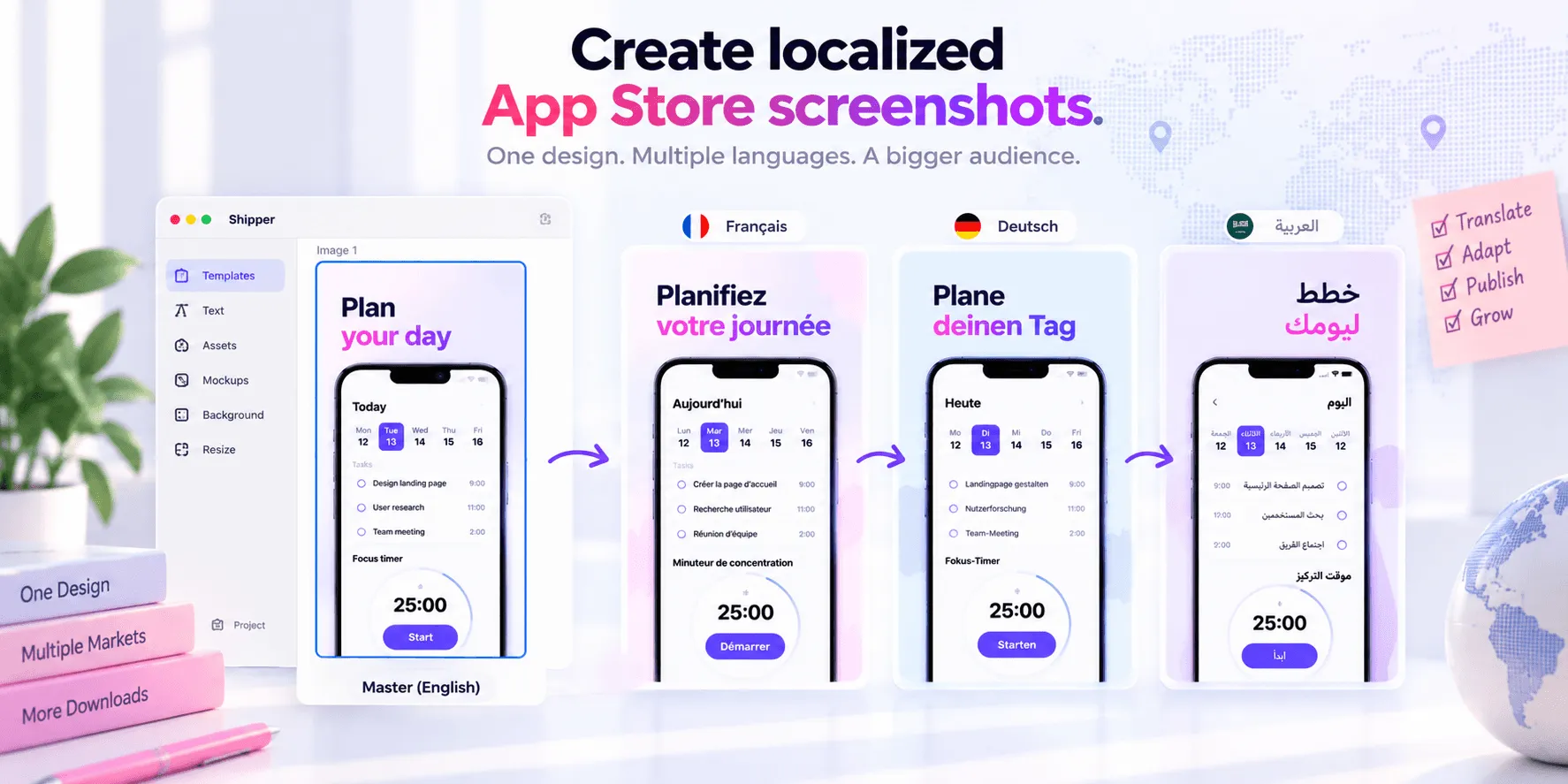
Localization can alter the composition even when the mode stays unchanged. Longer text may need different line breaks or more space around the device. Right-to-left languages can affect alignment and reading order.
Capture the app in the correct language when visible UI supports the message. Check that the localized headline uses the same terminology as the interface.
Do not choose another mode for a market based only on assumptions about local taste. Change it when you have a product reason, reliable insight, or a testable hypothesis. The App Store localization guide explains the wider workflow.
Test one appearance hypothesis at a time
Apple’s Product Page Optimization lets eligible developers test alternative screenshots, previews, and app icons against the original product page.
Keep the experiment controlled. If the hypothesis is “dark mode makes the media workflow clearer,” preserve the copy, order, UI state, and layout. Change the appearance and necessary contrast adjustments only.
Changing the mode, headlines, sequence, and crop together prevents you from knowing what caused the result. Apple’s analysis also needs sufficient data before assigning confidence, so do not treat early movement as a conclusion.
Read How to A/B test App Store screenshots before preparing treatments.
A practical decision checklist
Before choosing light mode, dark mode, or both, ask:
Does the app genuinely support this appearance?
Which mode makes the UI evidence clearest?
Is everything readable at thumbnail size?
Are contrast and status colors accessible?
Does one mode fit the common usage context?
Can the system work across devices and localizations?
If modes are mixed, does each change have a purpose?
Can the decision be tested without changing unrelated variables?
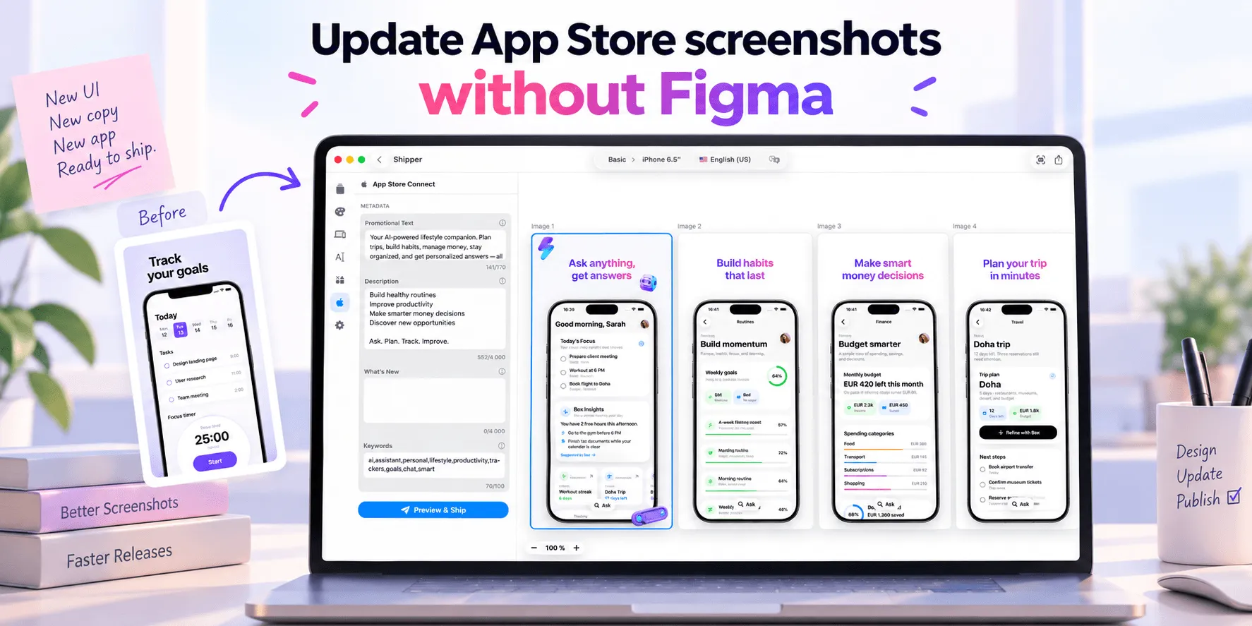
Shipper can help you reuse templates, prepare appearance variants, adapt layouts to supported Apple screenshot specifications, localize copy and metadata, preview each set, and publish approved assets to App Store Connect. The final choice still requires human review and, when possible, reliable test evidence.
FAQ
Is dark mode better for App Store screenshots?
Not automatically. Dark mode works best when it matches the real app, supports the product’s context, and keeps UI details readable at product-page scale.
Can I mix light and dark mode screenshots?
Yes, if the app supports both and each change communicates useful information. Keep the surrounding hierarchy and brand system consistent.
Should localized screenshots use the same mode?
Usually, but not always. Preserve a coherent global system unless market context, the localized product experience, or reliable testing supports a different choice.
Can Apple Product Page Optimization test light versus dark screenshots?
Yes. You can create screenshot treatments with different appearance directions. Keep other variables stable so the result addresses the mode hypothesis.