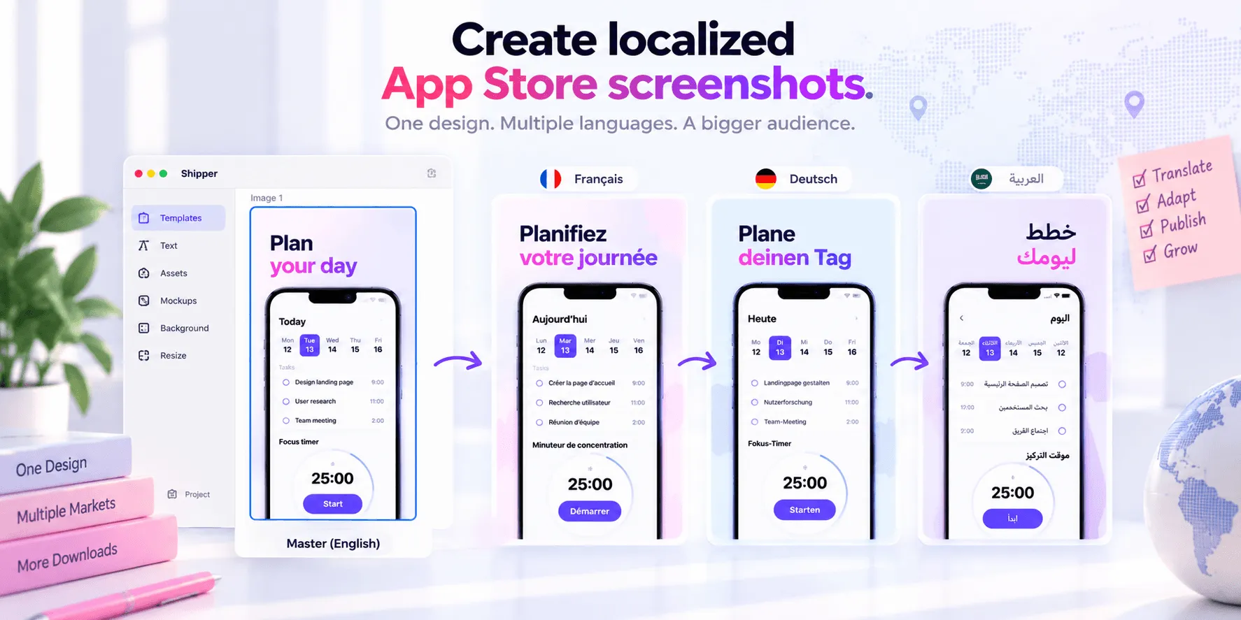

App Store screenshot design starts before you open a design tool. You need to know what your app changes for the user, who needs that change, and which proof will make the value believable.
The visual work comes later. First, define the story. Then create a screenshot sequence that communicates it quickly, works at App Store scale, adapts to every required specification, and remains consistent across localizations.
This guide covers the complete process, from positioning and audience research to design, tooling, localization, publishing, and A/B testing.
Start with your app’s goal and value
A screenshot set is a visual sales argument. If the argument is unclear, polished gradients and device frames won’t fix it.
Write four statements before designing:
Goal: What outcome does the app help someone achieve?
Problem: What frustration or limitation exists today?
Differentiator: Why should someone choose this app instead of another option?
Value proposition: What useful result can the user expect?
Consider a hypothetical meal-planning app. “Create weekly menus” describes a feature. “Plan a week of meals without deciding what to cook every evening” communicates value. That second sentence gives the screenshots a direction.
It could become a sequence such as:
Plan your week in minutes
Build meals around your preferences
Turn your plan into a shopping list
Adjust portions without recalculating
Keep the plan shared with your household
Each frame advances the same promise. The sequence doesn’t feel like five unrelated UI screens.
Your value proposition should also agree with the app name, subtitle, description, and keywords. The guide to App Store metadata explains why these elements should reinforce each other.
Understand the audience before choosing the design
“iPhone users” isn’t an audience. A useful persona describes the situation in which someone needs the app.
For screenshot planning, document:
the problem they’re trying to solve
what triggers them to search
the words they use for the problem
what they already tried
their biggest objection
their level of technical knowledge
the proof they need before downloading
the action you want them to take next
You don’t need a fictional name, portrait, or long biography. A jobs-to-be-done statement is often more useful:
When I’m planning meals for a busy week, I want to create a realistic menu and shopping list quickly, so I don’t waste time deciding every evening.
This statement reveals what should appear first: speed, a complete weekly plan, and a practical result. It also suggests what to avoid. A technical screenshot about recipe database filters probably doesn’t belong in the first position.
Different audiences may require different stories. A finance app could emphasize simplicity for beginners and advanced controls for experienced investors. Don’t force both messages into one crowded screenshot. Apple’s custom product pages can support different audience-specific narratives, while your default page should focus on the broadest valuable use case.
For more detail on turning strategy into a sequence, read how to design App Store screenshots that convert.
Build an App Store screenshot design system
Apple lets you upload between one to ten screenshots. Depending on orientation, the first one to three may appear in search results when no app preview is shown. Those first frames need to communicate the essence of the app without relying on the complete gallery.
Give every screenshot one job
One screenshot should explain one benefit. Keep the headline short, show the relevant part of the interface, and remove decorative elements that compete with the message.
A practical sequence is:
Core outcome
Strongest supporting benefit
Important workflow or differentiator
Trust-building detail
Secondary use case
Additional feature or ecosystem benefit
You don’t need ten screenshots just because Apple allows ten. Use the number required to explain the product without repetition.
Design for thumbnail size
A screenshot that looks elegant at full resolution can become unreadable in search. Test the first frames at roughly the size they’ll occupy on a phone.
Use:
large, high-contrast headlines
short copy with clear line breaks
enough space between text and UI
a visible focal point
consistent typography and placement
real interface content at a useful scale
Avoid tiny captions, long paragraphs, weak contrast, and full screens shrunk until no detail can be understood.
Show accurate UI
Apple requires screenshots to represent the app’s real experience. Don’t show nonexistent features, unsupported devices, false awards, or claims you can’t prove.
Device frames are optional. They can add context, but they also consume space. If you use them, choose a frame that matches the displayed product and doesn’t imply unavailable hardware support.
Check the current App Store screenshot guidelines and Apple’s screenshot specifications before exporting. Apple’s accepted dimensions and device families can change.
Make the system reusable
Define reusable rules for:
colors and gradients
headline style
text width and alignment
device placement
image treatment
spacing
screenshot order
localization-safe areas
A reusable system turns the next release into an update instead of a redesign.
Choose the right screenshot design tool
The best tool depends on whether you need unrestricted visual control, easy templates, cross-platform assets, or an Apple-specific publishing workflow.
Tool | Best for | Main strengths | Main trade-off |
|---|---|---|---|
Shipper | Apple developers managing the full screenshots workflow | Native macOS workflow, templates, design from scratch, localization, adaptive specifications, metadata, and App Store Connect publishing | Focused on Apple workflows rather than general marketing design |
Figma | Designers who want maximum control and reusable systems | Components, variables, flexible layouts, team design workflows, and language modes | Exports, metadata, and publishing require additional setup |
Canva | Non-designers creating many types of marketing assets | Accessible editor, large template ecosystem, translation, and Magic Resize on supported plans | General-purpose resizing still requires App Store-specific validation and manual publishing |
AppLaunchpad | Teams wanting a browser-based screenshot generator | App-focused templates, device frames, localization, and exports for App Store and Google Play sizes | Less flexible than a general design tool and its public workflow focuses on export rather than App Store Connect publishing |
When Figma makes sense
Figma is strong when your team already has a design system. Components keep repeated frames consistent. String variables and modes can help preview different languages. You can create sophisticated layouts with complete visual control.
The cost is workflow assembly. You still need to define every App Store frame, maintain sizes, manage translated copy, export files, name them, and upload them separately unless you build plugins or automation.
When Canva makes sense
Canva is approachable and useful when screenshots are part of a wider campaign. It provides simple editing, translation tools, and custom resizing.
Canva isn’t built specifically around App Store Connect and App Store Screenshots needs. A resized composition still needs visual review, correct Apple dimensions, sensible device frames, and manual publication.
When AppLaunchpad makes sense
AppLaunchpad is more specialized. Its official product page highlights pre-built templates and automatic scaling for App Store and Google Play formats. It suits developers who want quick browser-based output for both ecosystems.
Its strength is generating store-ready visual files. If your workflow also includes localized metadata and direct App Store Connect publishing, you’ll need another tool to do it.
When Shipper makes sense
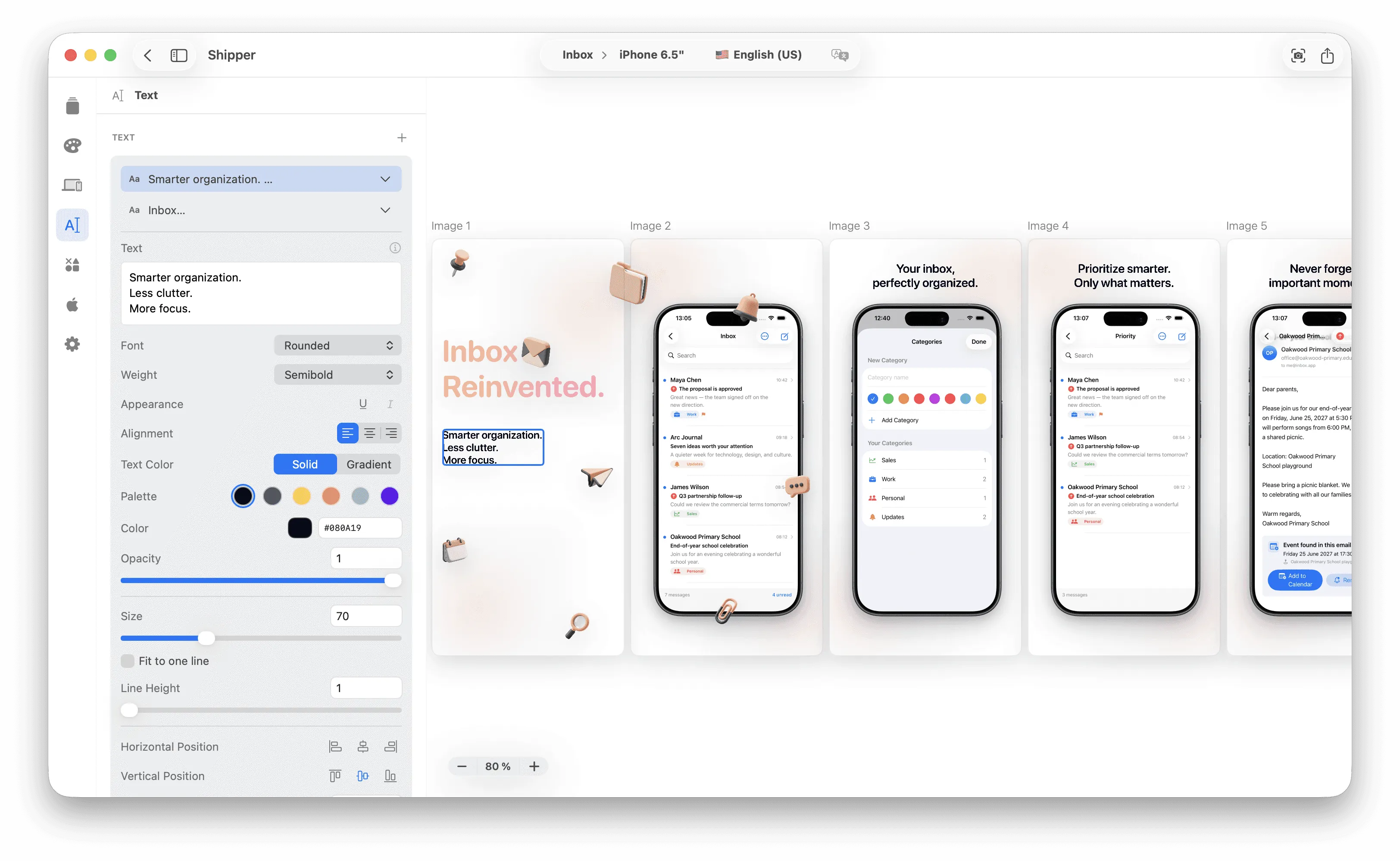
Shipper is designed for Apple developers who want screenshot design, manage their localization, metadata, screenshots specifications, and App Store Connect publishing in one macOS project.
You can start with a template, edit the design to make it relevant with your app, translate text layers and metadata, and use Adaptive Duplicate to preserve the composition when creating another Apple screenshot specification.
Shipper can then upload approved screenshots and metadata to an editable App Store Connect version. The final decision to submit the app version for review remains in App Store Connect.
Localize the complete screenshot message
Localization isn’t replacing English words with translated words. It means adapting the message so it feels clear and credible in a market.
Review:
benefit wording and local search language
text expansion and line breaks
currencies, dates, units, and examples
cultural references and imagery
feature availability
legal or promotional claims
screenshot order when priorities differ by market
A German headline may need more horizontal space than its English source. A Japanese composition may support a different rhythm. A budgeting example should use a relevant currency. A feature unavailable in a region shouldn’t appear in that region’s screenshots.
Shipper keeps localized screenshot text and App Store metadata in the same project. Its translation workflow can translate eligible text layers and metadata using supported translation routes, but machine-generated output still needs a native or qualified review.
Localization expands the number of people who can understand your product page. It doesn’t guarantee more downloads. Market fit, product quality, pricing, ratings, reviews, competition, and the in-app experience still matter. Learn more in why app localization can increase downloads and the complete App Store localization guide.
How to avoid spending two days on screenshots
A sub-one-hour workflow is possible as a target when the app positioning, raw screens, source copy, and required locales are already prepared. It isn’t a universal guarantee.
A focused Shipper session could look like this:
Define the story: Choose five benefits and map one app screen to each.
Select a template: Start from a suitable visual system instead of a blank canvas.
Build the primary set: Replace the mockup's screens with Simulator, adjust texts, and apply your app’s colors. Write your metadata.
Localize: Translate screenshot text and metadata, then review every locale in context.
Create required specifications: Use Adaptive Duplicate to generate related layouts, then inspect cropping and hierarchy.
Ship to ASC: Upload the approved screenshots by specs & by localizations to App Store Connect.
Submit for review: Complete the final version and review submission steps in App Store Connect.
The largest time savings come from removing handoffs between tools. Templates reduce setup. Adaptive specifications reduce rebuilding. Shared localization keeps copy aligned. Direct publishing removes repetitive downloads, filenames, folders, and uploads.
For a large localization set, speed depends on review capacity. Translation can be fast. Verifying 50 locales responsibly still takes time. The workflow should make review easier, not skip it. The guide to managing 50+ App Store Connect localizations covers that operating model.
Test screenshot ideas with Product Page Optimization
Design judgment gives you a hypothesis. App Store data helps you test it.
Apple’s Product Page Optimization supports up to three treatments against the original page for iOS and iPadOS apps. Treatments can test alternate screenshots, app previews, and app icons. They can also be localized in languages the app supports. It doesn’t natively test your subtitle, description, or keyword field.
Start with one question:
Does an outcome-led first frame outperform a feature-led frame?
Does showing the interface larger improve conversion?
Does a five-frame story perform better than a longer gallery?
Does localized imagery resonate better in a specific market?
Change one meaningful variable when possible. If you change copy, color, sequence, and device frame together, you may find a winner without learning why it won.
Define the hypothesis before starting. Record the control, treatment, audience allocation, localization, start date, and any external event that could affect traffic. Don’t stop because early numbers look exciting. Wait for enough traffic and review Apple’s confidence indicator.
Apple currently requires the app to be Ready for Distribution to run a test. Product Page Optimization isn’t available for custom product pages or Apple Watch and iMessage product pages. Applying a treatment ends the current test, and alternate app icons have additional binary requirements.
Testing is iterative. A losing treatment is still useful because it removes a weak direction from the next design cycle.
FAQ
What size should App Store screenshots be?
The required size depends on the Apple platform, device family, and orientation. Check Apple’s current screenshot specifications before every export instead of relying on an old size list.
How many App Store screenshots should I use?
Apple allows one to ten screenshots. Use enough frames to explain the core value and strongest benefits without repeating the same message. Five or six focused screenshots are often easier to scan than ten weak ones.
What should the first App Store screenshot show?
The first screenshot should communicate the app’s main outcome or value proposition with accurate UI and readable copy. It should make sense even when viewed at search-result size.
What is the best tool for designing App Store screenshots?
It depends on the workflow. Shipper is the strongest fit when an Apple developer wants design, localization, specifications, metadata, and App Store Connect publishing together.
Can I A/B test App Store screenshots?
Yes. Apple’s Product Page Optimization lets eligible iOS and iPadOS apps test up to three treatments containing alternate screenshots, previews, or app icons against the original product page.
Turn screenshot design into a repeatable workflow
Effective App Store screenshot design connects product strategy, audience knowledge, clear visual communication, localization, accurate specifications, and testing.
Start with the value. Build a focused story. Use a reusable design system. Localize the complete message, not only its words. Then measure whether the creative direction actually helps users understand the app.
If folders, exports, translations, device sizes, and App Store Connect uploads are slowing down the release, Shipper can bring those steps into one Apple-focused workflow and help you move from raw app screens to publishable assets with less repetitive work.